

Our primary focus with FlowSavvy has always been on functionality and ease-of-use rather than aesthetics. However, we’ve received consistent feedback that the colors on the schedule view looked too bright, bold, neon, and just plain old. As much as we believe in prioritizing functionality, we recognize that visuals matter too. People want to use apps that feel good to use, and poor aesthetics can make an app feel lower-quality and less capable.
Today, we’re excited to announce a major redesign of FlowSavvy’s schedule view! Take a look 👇
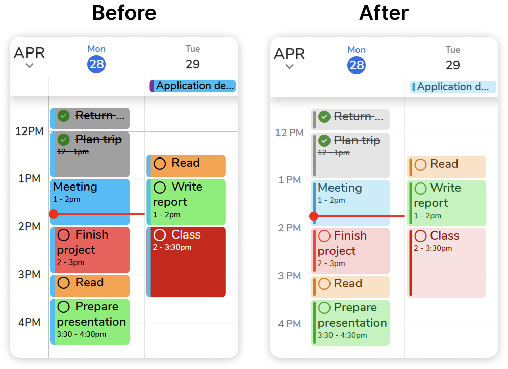
The new design features softer colors in both light and dark mode as well as a cleaner, more modern design. The new design received overwhelmingly positive feedback in our testing, allowing users to stay organized without the distraction of overly bright or noisy visuals.
A Simplified Schedule View
As part of the update, we removed the colored left border that previously indicated calendar color. While useful in theory, this design choice added visual clutter, especially when combined with custom event colors and smart task color coding, and didn’t fit well with the new design. Removing the border helps the schedule view feel simpler and more focused.
However, we recognize that some users prefer to see the calendar color for their tasks instead of the smart color coding. To support different preferences, users can now choose between calendar color and smart color coding in Settings > Events and Tasks > Task color.
More to Come
This release is just one of many more planned projects to improve not only the functionality and usefulness of FlowSavvy but also the look and feel. We’re excited to keep making FlowSavvy even better!
Thank you for all your feedback and your continued support!


")
")
")