We have a massive update to share with you this month! The entire layout of FlowSavvy has been improved, so here is a rundown of the biggest changes, why we made them, and some fun FlowSavvy history.
Summary of What’s New
- Menu is now on the left side
- The event/task view is now a draggable, floating window
- New settings view
- Mobile views and gestures have changed
- Other changes
The details
Most of these descriptions will be focused on the desktop web app version, since that’s where the most drastic changes are. Skip to #4 below if you’re looking for what changed on the mobile apps!
1. Menu is now on the left side
After years of having all sidebars on the right side of the screen, the menu has now been moved to the left on both the web app and the mobile app.
This may seem like a small change by itself, but it opens the door for what’s coming.
The biggest reason for the change is that it’s necessary for an upcoming lists/projects feature. Having a way to categorize tasks into different lists/projects is currently the #1 most-requested feature, and there are so many other reasons why FlowSavvy needs projects, so we’re making it happen.
However, it naturally makes sense to click on the project name on the left, and then the tasks in that project show up on the right. Instead of having a sidebar on both the left and the right, it makes way more sense to have just one sidebar on the left, so we’ve moved the menu in preparation for projects, which will be coming soon!
If you’re interested in the history and reasonings behind the right sidebar, check out the behind-the-scenes section at the bottom of this page!
2. The event/task view is now a draggable, floating window
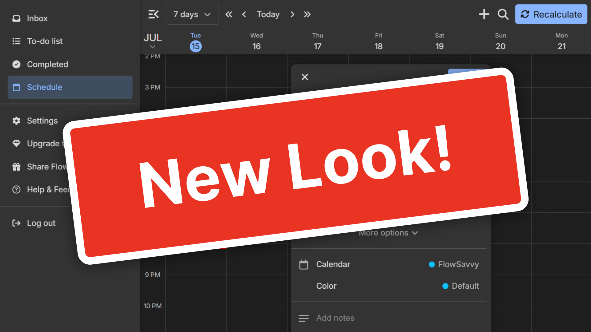
The event/task view now opens right on the calendar next to the calendar item you’re editing instead of in the right sidebar. Here’s what it looks like!
This view can also be dragged by dragging and dropping the header. On mobile and smaller screens, this view is still full screen.
So, why did we make this change? Another main driver for getting rid of the right sidebar was to get rid of the annoying screen resizing every time you added or edited a task. When making lots of changes, your calendar was always shrinking and growing to make room for the sidebar opening and closing.
Here’s an example showing the shifting in the old version:
With the new version, you can create and edit your events and tasks seamlessly, with no screen shifting, less mouse movement, and an overall more modern feel.
3. New settings view
The settings view is now a large popup with a redesigned layout. Here’s what it looks like on the web app:
We had a few reasons for this change:
- First, we got rid of the right sidebar, so we also needed somewhere for the settings to go, since all of the settings used to be in the right sidebar
- We also want to make it easier to configure additional settings in the future (for example, advanced integration setups) rather than have them crammed in the sidebar
- In general, this helps the app feel more modern and familiar
4. Mobile views and gestures have changed
On the mobile apps, views like settings and the event/task view used to be full-screen views that slid in from the right. This isn’t a very common pattern, so to give the app a more modern feel, main views like settings and the event/task view now slide up from the bottom of the page in drawers. Subviews (for example, deeper levels of settings) will still slide in from the right inside the drawers.
Another added benefit of opening main views from the bottom is that now views can be closed immediately, no matter how far down in the sub-views you are. For example, if you’re 3 levels into the settings, on the old version, you would have had to swipe back 3 times before closing the settings. Now, you can just swipe down to close the entire settings view immediately.
We recognize the switch to using drawers for the settings and event/task views may take some time to get used to if you have muscle memory from the old version, but we believe this is a step forward in making the app smoother and more modern.
5. Other changes
While these aren’t related to the layout redesign, we did release some other changes with this update:
- The backspace and delete keys now both delete events and tasks
- The “Esc” key can now be used to close all popups, dropdowns, and views
- Major behind-the-scenes improvements for long-term reliability and performance
- The “today” button now auto-scrolls to the current time if it’s not already visible
- Custom repeat rule weekday options have been duplicated to the “Daily” options to help people find them
Final notes
This update brought a lot of change — much more than is even visible on the surface. If you have any feedback on the update, please reach out! You can email feedback to support@flowsavvy.app, ask questions in the in-app help center, and submit feature requests in the in-app help center.
This rework has laid the foundation for many of the next big features, which we’ve already started working on! We hope you enjoy the updates, and stay tuned for some even bigger features coming soon!

